there’s this Naval Ravikant line that’s been living in my head rent free for a while now
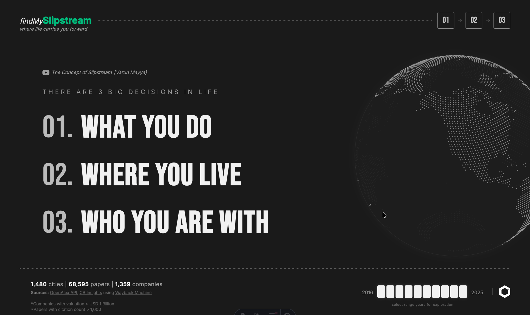
there are 3 big decisions in life: what you do, where you live, who you are with
for my Data Exploration and Visualisation unit at Monash (FIT5147, shoutout to my TAs Shruti and Angel), I had to take a messy real-world dataset all the way from a proposal to a wrangled dataset to a statistical exploration to a shipped interactive product. most people in my cohort picked a dataset and then went looking for a story. I went the other way, I had this quote stuck in my head and went looking for a dataset that could answer it, then spent the semester proving it out end to end: sourcing and cleaning the data myself, exploring it rigorously in R, designing the interface on paper first, then building the thing in D3.
this post is the whole arc, not just the pretty final screens.
The Pitch
the original proposal was called “The Efficiency of Innovation”, later renamed “The Curiosity Engine”. the premise: governments and VCs pour billions into research and tech districts, but a city having top-tier universities doesn’t guarantee it produces Unicorn startups ($1B+ valuation). some cities do the research and someone else captures the value. I wanted to find, and then visually prove, exactly where that gap opens up.
three questions anchored the whole project:
- how does high-impact academic research intensity in a city relate to Unicorn startup emergence there, 2018–2025?
- which cities over- or under-perform at converting research into Unicorns, relative to their output, and how has that shifted over time?
- which cities offer the most “efficient slipstreams” for a career in emerging tech, given the alignment between local research strength and industry focus?
that third question is where the product name comes from, and it’s the one the final interactive tool is built to answer directly for whoever’s using it.
Building the Dataset
before any of the visual work, I had to go get the data myself, and none of it arrived clean.
academic side: the OpenAlex API gave me global citation and institution data, filtered down to 68,595 high-impact papers published 2016–2025 (citations ≥ 1,000). papers are co-authored across institutions in multiple cities, so I used R’s tidyr::separate_rows() to explode multi-institution authorship strings, a landmark Stanford/MIT co-authored paper correctly contributes its full citation value to both cities instead of getting arbitrarily assigned to whoever was first author.
commercial side: CB Insights only publishes current unicorn data, not history. to reconstruct the 2016–2025 trend I wrote a Python scraper against the Wayback Machine, pulling 50+ timestamped snapshots of their leaderboard with requests and BeautifulSoup. that alone got messy fast, 12% of scraped rows came back with no city field. I built a multi-stage recovery pipeline: first imputing city from the startup’s lead investor’s HQ, then a recursive corporate-HQ lookup for the stragglers, and finally a geocoding fallback for whatever was left. that took the commercial dataset from 12% missing to a verified 0% missing across all 1,215 unicorn observations.
geographic backbone: SimpleMaps’ World Cities database (~48k cities) was the join key that stitched the other two together, but city names disagree with each other constantly. “Bangalore” vs “Bengaluru,” five different renderings of “Tel Aviv,” UK county names instead of city names. I built a resolution engine that ASCII-normalizes and fuzzy-matches against the reference set, with manual heuristic intervention for the 865 stragglers it couldn’t resolve automatically. final result: 97.3% spatial confidence on the geocoded set.
the hardest wrangling problem, though, wasn’t missing data, it was semantic. academic fields and commercial industries don’t speak the same language. a paper says “Advancements in Battery Materials,” CB Insights says “Energy Storage.” I wrote an aggressive regex-based ontological harmonization script (industry_harmonization_utils.R) that collapsed thousands of fragmented, redundant tags, things like “Computer Vision,” “Face Recognition,” and “RPA” all folding into a canonical Artificial Intelligence bucket, cutting noise in later visualisations by roughly 4x. without that step, the two datasets never would have been comparable at all.
What the Data Actually Said
with a clean joined dataset, I moved into R (tidyverse + ggplot2) for the exploratory phase, this is where the story the app eventually tells was actually discovered, not designed.
first surprise: both distributions are brutally power-law. citation counts range up to 800k, unicorn valuations up to $225B (Bytedance). a plain bar chart or linear scatterplot just obliterates everything below the outliers, so log-10 transforms weren’t a stylistic choice, they were the only way to see the rest of the dataset at all.
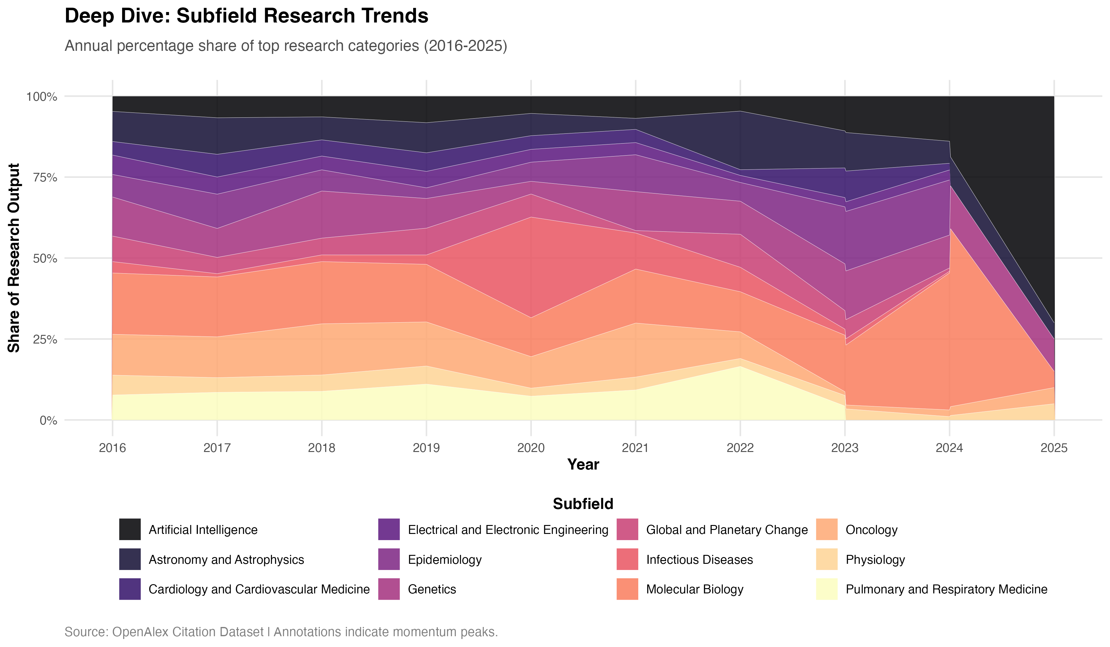
with that resolved, I built a streamgraph of research topic share over time to chase the “temporal pulse” question, does academic attention predict where commercial value shows up later? the subfield-level view makes it obvious: Artificial Intelligence holds a steady baseline share through 2016–2020, then a massive bulge invades the graph between 2021 and 2024, aggressively displacing traditional computational disciplines. cross-referencing that surge against when AI unicorns actually hit their hyper-valuations pointed to a consistent 24–48 month predictive lag, academic obsession precedes the commercial payoff by roughly two to four years.
next I built a bipartite co-authorship heatmap mapping elite universities against corporate R&D labs (Google, DeepMind, Microsoft, Meta, and so on), to see where industry and academia were actually collaborating versus just coexisting in the same city.
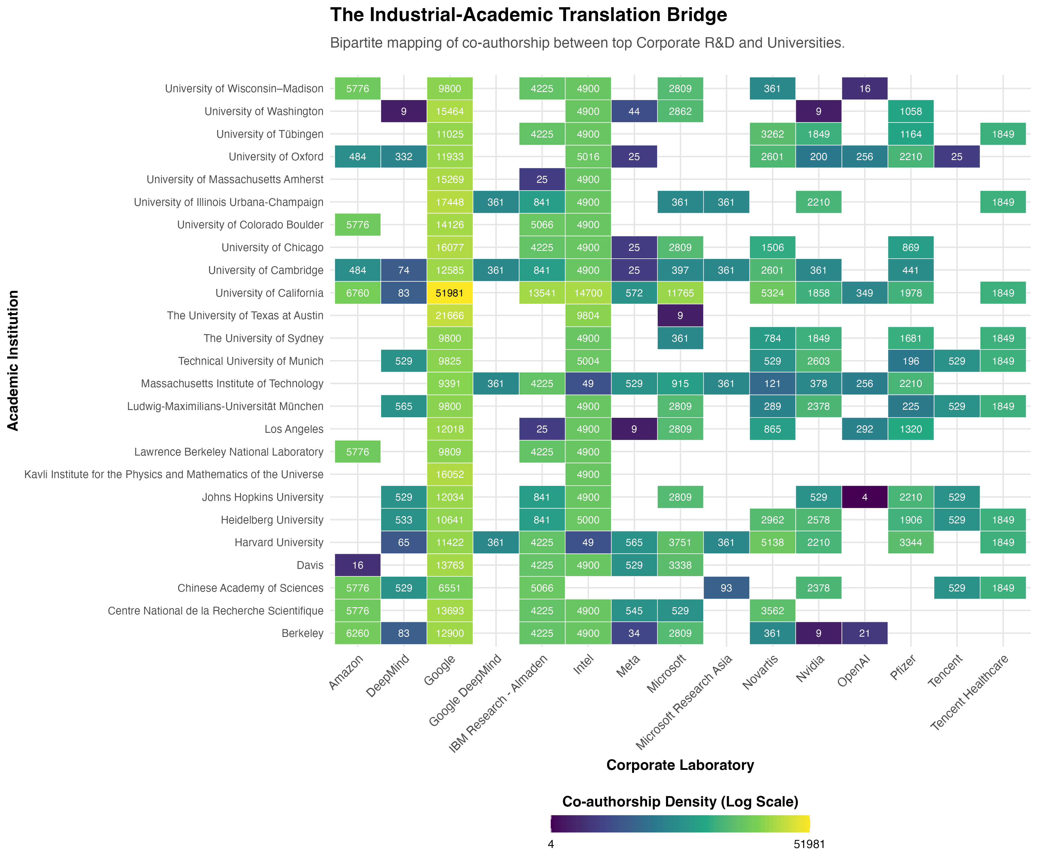
a few bridges are extremely dense, Microsoft Research runs deep into Stanford and MIT, DeepMind is locked into UCL. but huge stretches of the matrix are just empty. plenty of high-output, elite universities have effectively zero corporate co-authorship. I started calling these “Islands of Innovation,” places doing excellent research that industry simply isn’t tapping into locally. that finding became one of the load-bearing ideas behind the whole product.
then the core result, the one the entire interactive tool got built around: a log-log quadrant scatterplot of every city’s total research citations against total unicorn valuation, sliced at the medians into four archetypes.
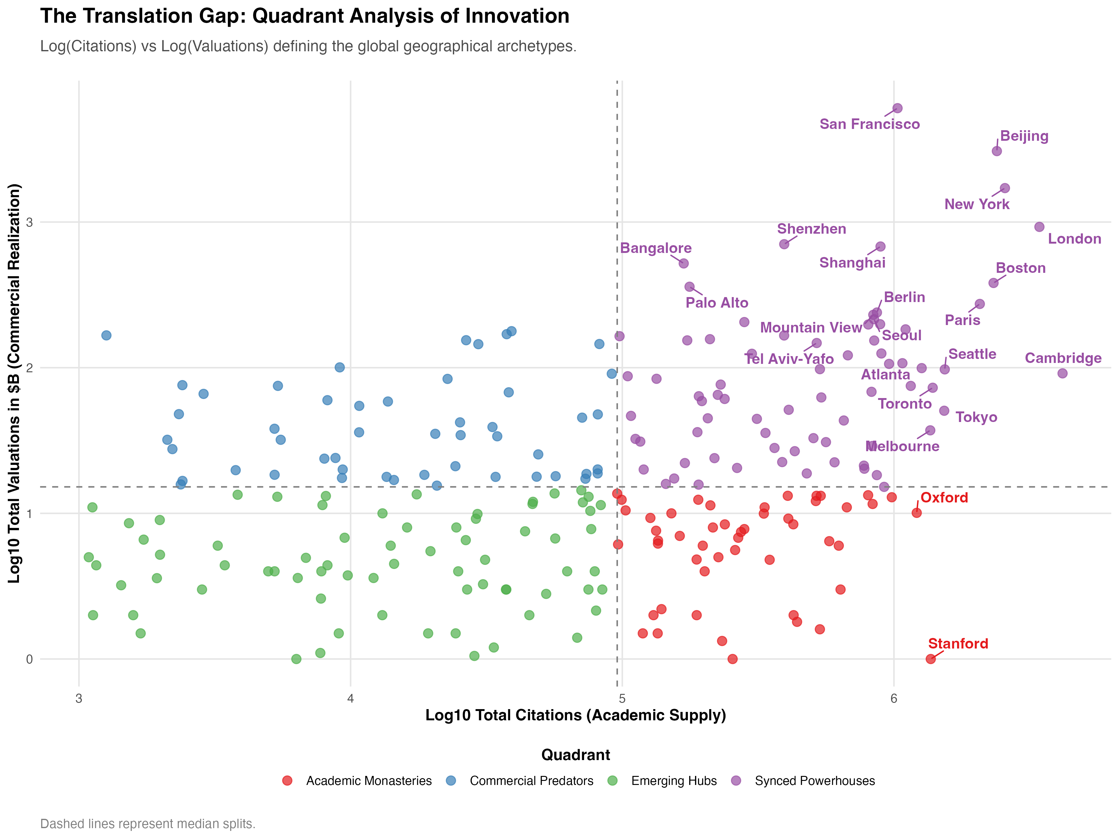
San Francisco and Beijing sit at the true top-right peak, research and commercial capital moving in near-lockstep. Cambridge, Oxford, and Stanford plot as Academic Monasteries, brutal citation density that just doesn’t convert locally, my residual model estimated they’re producing research at a volume that could theoretically support 2–3x more local commercial valuation than currently exists. and there’s a visible cluster of Commercial Predators that clearly import talent and capital rather than growing it from local research. that gap between the monasteries and the predators is what I ended up calling the Translation Gap, and it’s the single finding the entire product is designed to let someone explore for their own field, instead of just reading about mine.
Killing the Sankey (Three Times)
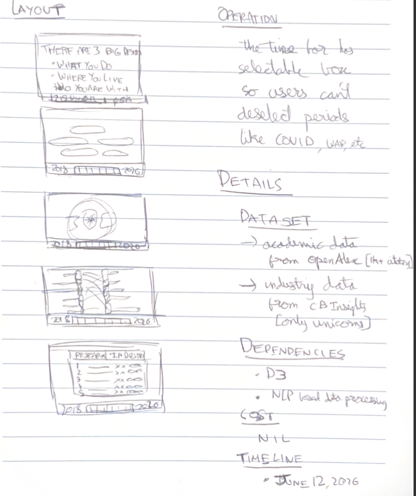
with the analysis done, the second half of the semester was a completely different discipline: turning a finding into something someone else could actually use. this unit runs on the Five Design Sheet methodology, sketch a bunch of ideas, build 3 full alternative interfaces, then synthesise a final one. I did the sketches on paper before touching a single line of D3, which if you know me is very unlike me.
my first instinct, and my second, and my third, was a Sankey diagram. research topic flows into industry, the width of the flow shows the strength of the relationship, feels obvious right?
except every single version of it lied. a directional arrow from a research city to a unicorn company visually implies “this research caused this company,” which even my own residual analysis only supports as a correlation, not causation. I presented an early version in the DVP Part 1 review and got called out for exactly this, and honestly they were right to call it out. I tried to save the idiom twice more, once as a city-level flow (killed because most city-topic pairs are near-zero, producing a Sankey that’s basically empty air) and once as an industry-first flow highlighted by selection (killed for the same reason, just skewed instead of sparse).
three discarded builds later I landed on something much less flashy: grouped bar charts, research performance and business performance shown as two independent, parallel metrics for your selected cities. no arrows implying a story the data can’t back up. it’s the least “clever” idiom in the whole project and it’s the one that actually survived contact with the audience.
the lesson that stuck with me: data structure constraints should precede idiom selection, not follow it. if I’d profiled how sparse the city-topic pairs actually were before sketching a Sankey, I’d have saved myself two entire rebuilds.
Three Decisions, Three Pages
the final structure just is the Naval quote. no clever information architecture, the three decisions became the three pages, in order:
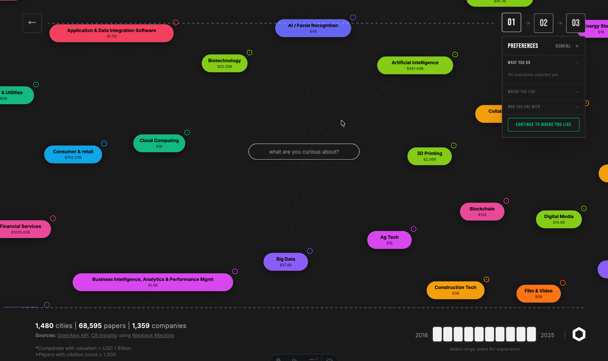
What You Do — a D3 force-directed network of industries and research topics. click an industry pill and it drags in every research topic mapped to it. this is where you tell the tool what you’re actually curious about.
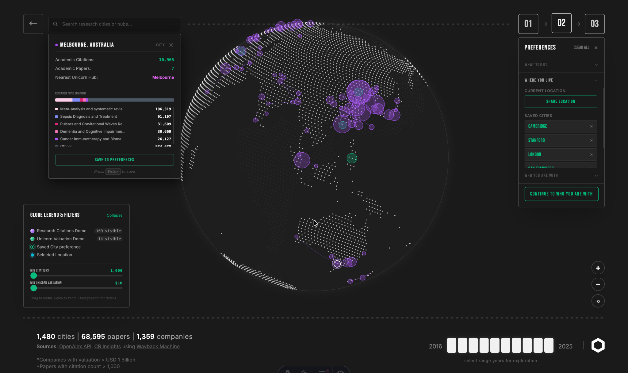
Where You Live — a rotatable globe (pure D3, no three.js, more on that below) where every city is a bubble sized by your selected topics’ citation counts and your selected industries’ unicorn valuations at once. colour does the heavy lifting here: violet for research-heavy cities, emerald for commercially-dominant ones, and cyan where the two blend, meaning the city is genuinely synced on both axes, the same archetype logic from the quadrant scatter, just made explorable instead of static.
Who You Are With — once you’ve picked a few cities to compare, this page breaks down the actual institutions behind the numbers, leaderboards of the specific universities and companies driving each city’s score, not just an abstract ranking.
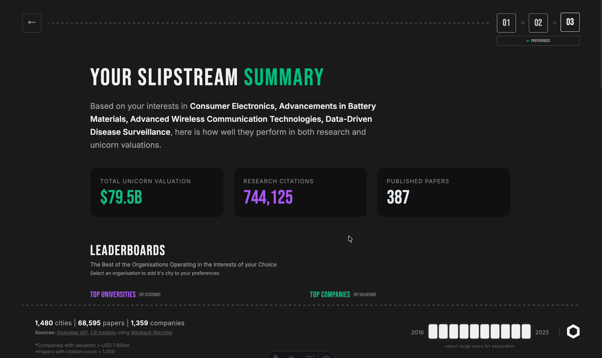
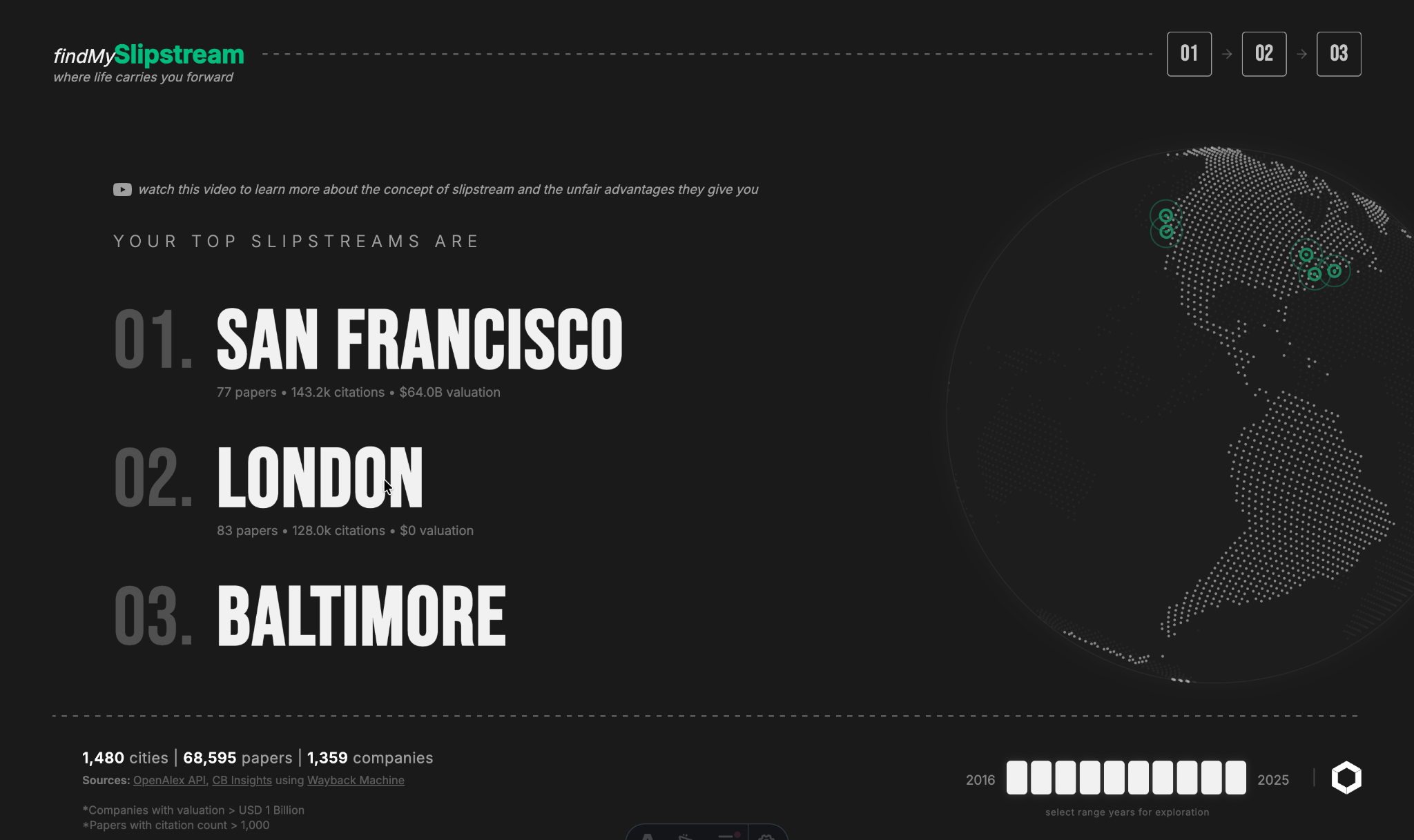
and then a results page ties it back together, a ranked list of your best-fit cities that, when you hover an entry, animates the globe back on Where You Live to re-center on it. full circle.
The Technical Bits I’m Proud Of
a few things that were annoyingly hard in ways that don’t show up in the screenshots:
the globe is 100% D3, no three.js, no WebGL library. rotating it by drag meant hand-rolling quaternion-style rotation with D3’s versor utility and projecting every bubble back onto the sphere surface after each rotation. it’s the kind of thing that “should” be a three.js one-liner and instead ate a weekend.
the network graph on What You Do runs a live search filter on top of a force simulation with two different node types (industry pills and topic pills, with different collision radii), and the filter has to suppress non-matching nodes and edges without restarting the whole simulation, otherwise every keystroke makes the graph visibly flinch.
and because this is an Astro site with each page as an isolated island, getting the Result page’s hover to reach across and animate a completely different page’s globe meant setting up a shared reactive store with nanostores. small thing, took way longer than it should have to get state syncing cleanly across islands that don’t otherwise know about each other.
Where This Leaves Me
looking back at the whole semester, the thing I’m most glad happened is that the design didn’t start from a blank canvas, it started from a rigorous R analysis that had already found the Translation Gap, the 24–48 month lag, and the Islands of Innovation. every interface decision after that was in service of a finding I already trusted, not a finding I was hoping the visualisation would somehow reveal. and the Sankey saga proved to me that being wrong about an idiom three times in a row and just building the discarded version anyway is a completely different discipline than sketching, it’s the actual job.
Claude helped tighten the written reports’ prose and kept them inside their page limits, and Antigravity/Gemini helped with initial script scaffolding and debugging once the analytical and design decisions were locked. but every wrangling decision, every statistical read, every killed Sankey, and every colour and layout choice was mine to make and defend.
if you want to poke at the finished product yourself, it’s live at find-my-slipstream.vercel.app. go find your own slipstream, tell me what industry/topic combo breaks the globe first 😉
until next time !️ ✌
or you could spot me in the wild 🤭 i mean instagram, twitter, linkedin and maybe even youtube where i may make video versions of these blog posts