You Can’t Fix What You Don’t Measure
A UI/UX and data visualisation deep-dive into what my own sleep data reveals — and what it took to finally see it clearly.
I have a terrible sleep cycle. Not “I stayed up a bit late” sleep cycle. I mean chronically, chaotically, unpredictably terrible sleep cycle.
But I’m a data science student. So instead of googling “how to fix sleep” for the hundredth time, I pulled my actual sleep data, built some visualisations, and sat with what the numbers were really saying.
What follows is a design walkthrough of the data visualisation. This dashboard isn’t just a tool, it’s a mirror of my poor sleep habits.
The Design Philosophy: Making the Invisible Legible
Before we get into the habits, a word on the visualisation choices.
Sleep data is chronologically dense, multi-dimensional, and deeply personal. The wrong chart type either flattens it into something meaningless or overwhelms with noise. Each of the three visualisations here was built to answer a specific question:
- The Sleep Quality Heatmap → How has my sleep quality trended over time?
- The Recovery Heatmap → What does my body’s physiological response to sleep look like?
- The Bedtime/Wake-Up Sankey → What patterns exist between when I fall asleep and when I wake up?
The consistent dark theme isn’t just aesthetic, sleep is nocturnal and hence the UI should feel like it. The colour language is intended to be intuitive: blue/purple for optimal, orange for excess, red for insufficient. Users read the emotional register of colour before they read the legend.
Now let’s look at what the data actually shows.
Habit #1: I’m Sleeping the Wrong Amount — And Swinging Between Extremes
The first and most obvious problem isn’t just that I sleep too little. It’s the volatility.
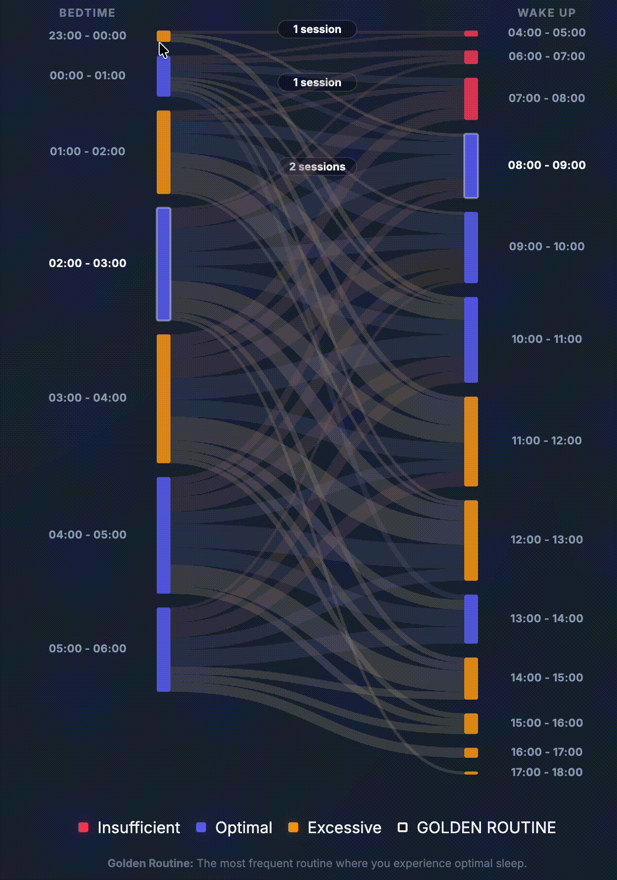
Look at the Sankey diagram. The right-hand column — wake-up times — fans out from 04:00 all the way down to 18:00. That’s a 13-hour spread in when my body is expected to start the day. Orange (excessive sleep) and blue (optimal) sit side by side across the weeks, with occasional flashes of red (insufficient) dotting the mix.
This is not a short-sleep problem. This is a regulation problem.
When you oscillate between 5 hours and 11 hours, your body never builds a reliable expectation of either. Sleep pressure (the homeostatic drive that makes you tired) gets thrown off. Melatonin release becomes unpredictable. You’re essentially resetting your circadian clock every few days — which is the metabolic equivalent of flying Melbourne to London, recovering, then flying back, repeatedly, forever.
The fix isn’t just “sleep more.” It’s “sleep consistently.”
Habit #2: The Missing Anchor
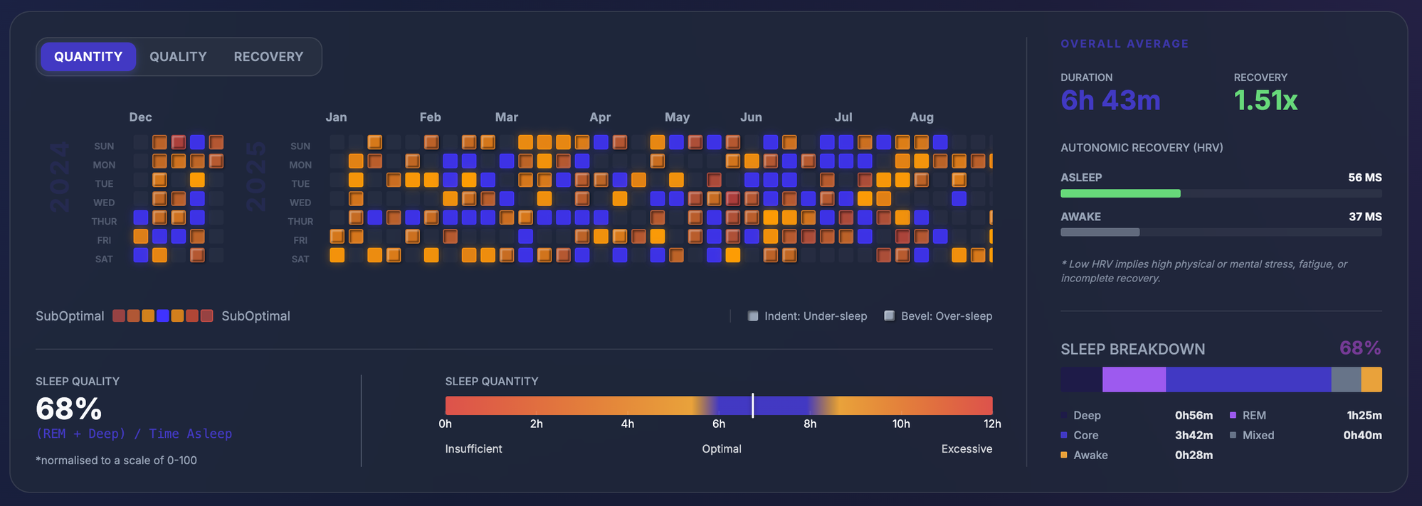
If the Sankey shows the chaotic destination (wake time), the Sleep Quality Heatmap reveals the lack of a stable origin.
From a dataviz perspective, this is where the indent/bulge encoding in the Sleep Quality Heatmap earns its keep. Squares that “indent” to highlight under-sleep and squares that “pop” to highlight over-sleep.
A consistent bedtime is a prior your body learns. Without it, your circadian rhythm is trying to predict sunrise with no reference point. Every system that depends on that rhythm… cortisol, melatonin, core body temperature is flying blind. The visualization makes the solution obvious: I don’t need to sleep more; I need to find an anchor.
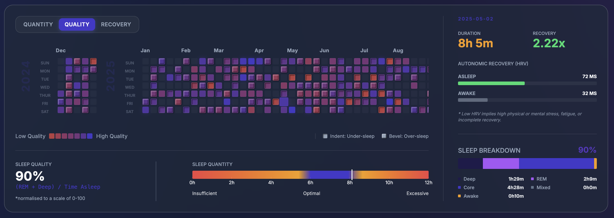
Habit #3: Quantity vs. Quality (The “Hollow” Sleep)
The instability shown in the previous charts leads directly to a deeper issue: I was spending plenty of time in bed, but my Sleep Quality Ratio was chronically low.
In the first iteration of the dashboard, my overall average quality sat at just 34% (a raw ratio, not normalized to a traditional 0–100 scale). To understand why that’s a problem, you have to look at the formula:
The Formula: (REM + Deep) / Total Sleep Time
Sleep isn’t a monolithic state; it’s a tiered architecture of recovery:
- Deep Sleep: where physical repair happens (tissue growth, immune function, and growth hormone release).
- REM Sleep: where cognitive restructuring happens (memory consolidation, emotional processing, and creative problem solving).
- Core Sleep: where “have a break” happens.
The visualization makes this imbalance impossible to ignore. In the color-coded bar of the Overall Average section, the slivers of blue (Deep) and purple (REM) are completely dwarfed by the pink (Core).
Most people assume that more total sleep automatically equals more restoration. It doesn’t. You can sleep for ten hours and still wake up biologically exhausted if your ratio is off. The data showed that I wasn’t just sleeping poorly, I was sleeping “hollow.” The composition is what actually drives recovery.
Habit #4: I’m Using Oversleeping as Compensation
The Sankey diagram has a particular cluster that’s hard to ignore: long flows connecting early-morning bedtimes (01:00–04:00) to very late wake-up times (12:00–15:00). These are the “recovery days” after particularly bad nights where I’m trying to claw back sleep debt with sheer volume.
This feels like recovery. The data says otherwise.
Sleep debt isn’t a bank account. You can’t deposit 11 hours on Sunday and withdraw it evenly across the week. What oversleeping actually does is delay your sleep onset the following night (because sleep pressure hasn’t had time to rebuild), which pushes your bedtime later, which shortens the next night’s sleep, which triggers another oversleeping compensation and the cycle continues.
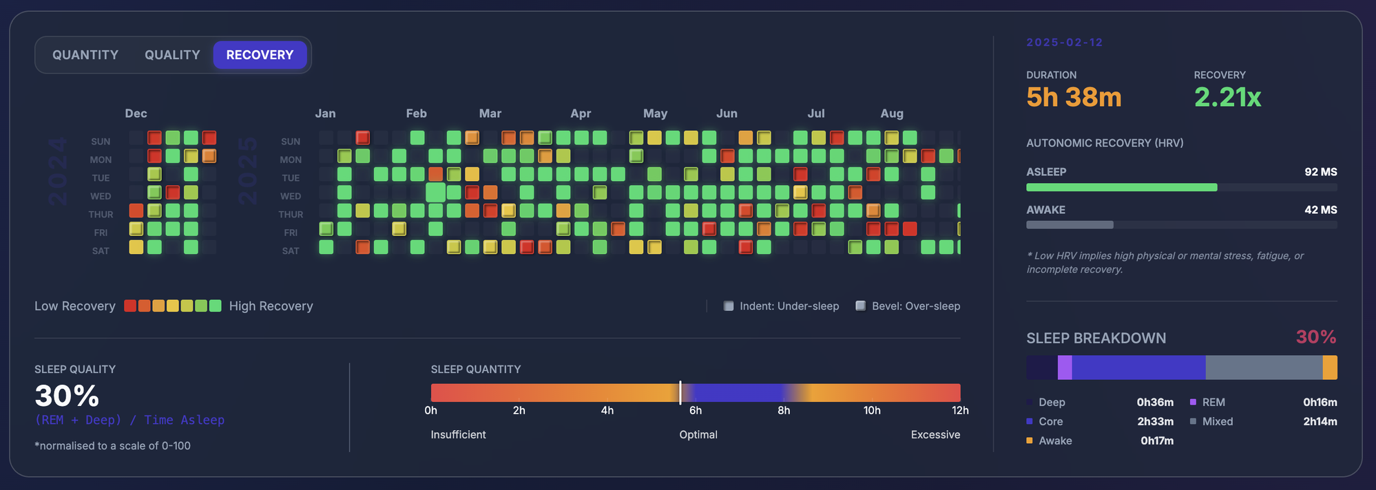
This feels like recovery, but the Recovery Heatmap tells a different story. While my Recovery Effectiveness (1.63x) shows my body can recover well, oversleeping actually pushes the next night’s bedtime even later.
The data reveals a vicious cycle: a bad night leads to an oversleeping “fix,” which destroys sleep pressure for the following night, which triggers another late bedtime. The visualization stops me from lying to myself about “catching up” on sleep.
What the Data Actually Recommends
Here’s where it gets interesting and validating in an uncomfortable way.
The Sankey diagram shows a Golden Routine: highlighted in the legend as the most frequent routine where I experience optimal sleep.
Bedtime: 02:00 – 03:00 → Wake up: 08:00 – 09:00
This isn’t a routine I invented; it’s what my own data says I’m already good at. The nights where I honour this 2am-3am window produce the strongest recovery metrics and the best HRV ratios.
The nights where I go to bed between 2 and 3am and wake between 8 and 9am are the nights that produce the best quality scores, the strongest recovery metrics, and the most consistent HRV ratios.
Statistically, if I want to fix my sleep, I don’t need to become a 6am person. I need to honour the rhythm my body has already demonstrated. The data isn’t asking me to be someone different. It’s asking me to be more consistent about who I already am.
Closing Thoughts: Data as Accountability Partner
There’s something uniquely confronting about seeing your own bad habits rendered in a well-designed chart.
A wall of raw numbers is easy to dismiss. But a heatmap where the chaos is visually undeniable, or a Sankey where inconsistency fans out across 13 hours, those are harder to look away from. That’s the real power of personal data visualisation. It doesn’t just inform; it implicates.
Now I can see it. The 2am bedtime isn’t the problem—the inconsistency around it is. The fix isn’t willpower. It’s just showing up for the routine my own data has already proven works.
Built using personal sleep tracking data. Visualisations designed to surface actionable patterns in sleep quality, duration and recovery metrics.
until next time !️ ✌
or you could spot me in the wild 🤭 i mean instagram, twitter, linkedin and maybe even youtube where i may make video versions of these blog posts